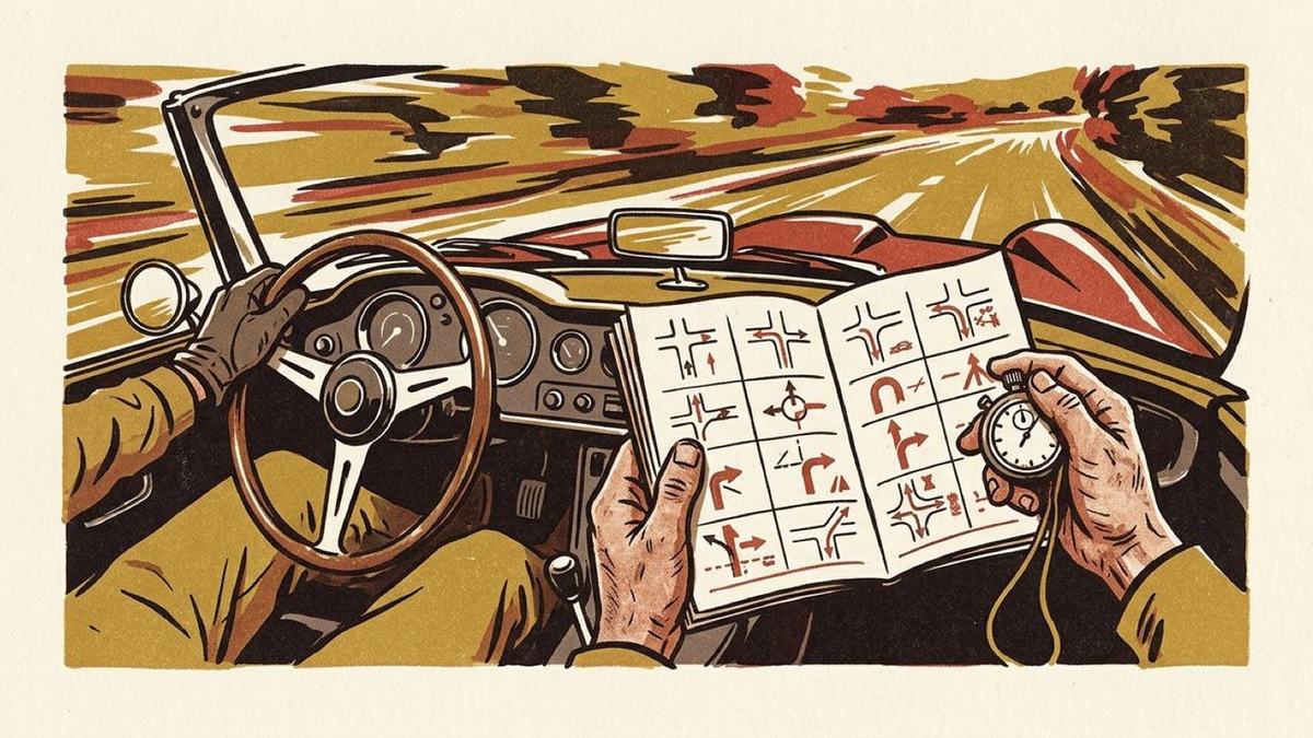
Open a rally roadbook at any page and you will find three columns. On the left, a distance. In the middle, a small square with a ball, a line and an arrow in it. On the right, a few words. That middle square is a tulip, and once you can read one you cannot go back to sentences.
The rule is short enough to say in one breath. The ball is where you come in. The line is the road through the junction. The arrow is where you leave. Everything else on the diagram (a stub going straight on, a ring for a roundabout, a second line joining from the side) is detail hung off those three things.
Why a picture and not a sentence
"Turn right at the second junction after the church" is a perfectly good instruction in a living room. In a car at 70 km/h it is four facts that have to be held in order, and the fourth one arrives after you have already committed to a lane.
A tulip is one fact. You see the shape, you match it to the junction coming at you through the windscreen, and you are done. There is nothing to hold, nothing to count, and nothing that goes stale if you are half a second late reading it.
The second thing a tulip does is subtler and more useful. Every tulip is drawn with the approach running up the page. The whole diagram is rotated so that the direction you arrive from always points at the top of the square. That means a left turn onto a road heading north and a left turn onto a road heading south-west come out looking identical, which is the point: as far as the driver is concerned they are identical. They are both "left". A north-up map cannot do that, because it keeps the compass fixed instead of the driver.
Where the notation comes from
The shape is older than the sport's modern form. Route books with sketched junctions were being handed to crews on European road events in the 1930s, but the tulip as a standardised, drawn-to-a-rule diagram belongs to the 1960s: to the Tulip Rally in the Netherlands, which is where the English name comes from, and to the long road events of that era (the Monte Carlo Rally, the Liège-Rome-Liège, the Tour de France Automobile), where a crew might be given hundreds of kilometres of unfamiliar road and expected to average a speed on it.
What forced the notation into existence was time. A co-driver on those events was reading continuously, out loud, for hours, in a cabin that was loud and moving and often dark. The document had to be readable at a glance, in a bad light, upside down in your lap, by someone being thrown around. Every convention on a roadbook page (the enormous distances in the left margin, one instruction to a line, the diagram instead of the prose, the generous white space) is a legibility decision made under those conditions. The way it looks is a side effect.
In Flanders and the Netherlands the diagram has a nickname that describes it better than "tulip" does: pijlke-bolleke, "little arrow, little ball". That is genuinely all it is.
How to read one at speed
Three habits make the difference between glancing at a tulip and decoding it.
- Read the ball first, always. Your eye wants to go to the arrow, because the arrow is the interesting bit. Train it to start at the ball. The ball tells you which way up the world is; without it the arrow is ambiguous.
- Read the shape, not the angle. You are not measuring 47 degrees. You are asking: does the road bend away hard, gently, or does it fold back? Sharp, normal, gentle, hairpin. Four buckets is enough.
- Use the dashes. A thin dashed line carrying straight on past the junction is the road you are not taking. It is there because the junction has two plausible exits and the diagram is telling you which one is wrong. If there are no dashes, there was nothing worth warning you about.
And the distance in the left margin is not decoration either. Two numbers are usually given: total distance from the start, and the increment since the previous line. The increment is the one you actually use, because it tells you how long you have before the next thing happens.
How Roadbook '71 draws yours
Every tulip in the app is computed from your own GPX. There is no icon library behind them, no lookup table of thirty stock junction shapes. The procedure is the same one you would use with a pencil and a large-scale map:
- Take eighty-five metres either side of the junction. That is enough road to see what the junction looks like on approach, and little enough that the diagram is the junction rather than the countryside around it.
- Measure the approach and rotate the whole window until it points up. The heading is taken over the first thirty metres, not over the first pair of GPS fixes, so a single noisy point at the edge of the window cannot tip the diagram on its side.
- Fit it into a square, keeping the aspect. Squaring it independently would turn a hairpin into a right angle, which is a lie about the road.
- Put the arrowhead on the true exit bearing, measured over the last stretch of the line rather than its final two points, because on a thinned path the last two points can be a rounding artefact.
The result is that no two junctions come out identical, because no two junctions are. A slightly-off-square crossroads looks slightly off square. A bend that tightens on the exit looks like a bend that tightens on the exit. If you have driven the road, you will usually recognise the diagram before you have read the words next to it, which is the whole reason the notation exists.
What the app cannot draw
Two honest limits, both of them consequences of the diagram being real rather than illustrative.
A junction where the road doubles back on itself through a full 180 degrees collapses, when you flatten it into a square, into a straight vertical line. That is geometrically correct and completely unreadable. In the app there is a map next to the diagram, so it is survivable; on a printed page it is not, which is why you will not see one in the sample roadbook.
And the diagram can only show the roads that are in your recording. A junction where five roads meet appears in the tulip as the one road you came in on and the one you left by, because the other three were never in the file. The dashed "straight on" stub is inferred from the instruction rather than from the recording: the words say turn, so there must be something to turn away from. That is a reasonable inference, and it is the only part of the diagram that is not measured.
You can see all of this for yourself: the sample GPX and the two-page roadbook printed from it are the same twelve junctions, and every diagram on both is computed by the procedure above.