Most apps do dark mode by taking the light design and inverting it. Backgrounds become dark grey, text becomes light grey, accent colours are desaturated so they do not glare, and the result is technically legible and completely characterless. It is the same document with the lights off.
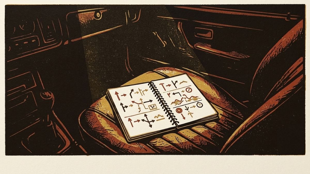
Roadbook '71's night pages are drawn as that same book under a map light.
The distinction sounds precious until you sit in a car at night and look at what is actually in front of you. A directed reading light throws a warm pool onto the page. The paper is not white any more; it has gone dim and yellow. The print is not black any more; it is a warm off-white where the light catches the raised ink. Everything outside the pool is not grey, it is nearly nothing, and it is leather. That is a specific and describable scene, and it is worth drawing rather than approximating.
The day page
The day appearance is straightforward and it came first. Aged stock, slightly green-yellow, the colour of a document that has been in a glovebox. Printing in a near-black ink that is warm rather than neutral. A feint ruling the width of a typed line, running behind everything.
Three inks on top of that, each with one job:
- Stamp red for controls, for the departure block, and for the line that tells you that you are not on the loop yet. It is a rubber stamp pressed onto the page, never ordinary text.
- Stamp green for a stretch signed off as driven. The other pad.
- Pencil ochre for the co-driver's own additions: margin notes, the road not taken, and the raw recording drawn underneath the computed route.
That last one is a genuine information design decision rather than a decorative one. The route is printed; your recording is pencilled. When they agree, the ink covers the pencil and you see one line. Where they disagree, the pencil shows, and that is precisely where you need to look.
The night page
Now put the same book on the passenger seat at night with a map light on it.
The ground goes to near-black rather than grey, because a cabin at night is not grey. The paper of the cards becomes dim warm parchment. The printing switches to a warm off-white, so it still carries on stock that no longer reflects much.
And the stamps stay red. This is the part everybody wants to change and it is the part that must not change, because a red stamp under a red map light is exactly what a red stamp looks like. Desaturating it to a "night-safe" muddy pink would be a photograph of the wrong thing. Red is the one colour that survives that lighting essentially intact; it is the reason instrument lighting has been red for a century.
The rule about grain
There is one rule that overrides everything above, and it is written into the theme in the source: paper grain, stamps and margin notes are welcome anywhere except underneath something a driver reads while moving.
So the page has grain. The cards do not. The maneuver card (the thing that tells you the next turn, the thing you glance at for two-fifths of a second at 70 km/h) is clean stock, no texture, maximum contrast, and no decoration whatsoever. The same goes for the car screen, which is CarPlay's own layout and deliberately unstyled.
This is where a texture-heavy design usually falls apart. The temptation is to put the paper under everything, because the paper is the nice bit. But a distress texture under a distance readout costs you legibility for no gain at all, and nobody has ever been delighted by grain behind a number they were trying to read at speed. The atmosphere belongs on the page, and the reading belongs on clean stock lying on it.
The launch screen
A small detail that took a disproportionate amount of the work: the app has no white flash on launch.
The first frame is already the app's own paper (the day ground by day, the night cabin by night) with the stamp badge on it. iOS chooses which of the two before the app has run a single line of code, so opening the app in a dark car at ten at night does not begin with a full-brightness white rectangle in your face.
The badge itself is painted rather than drawn in code, and cut out of its artwork by flooding in from the border so that it lands on the background with no square edge around it. That keeps the stamp's ragged rim and preserves the cream halo drawn inside the disc, which a plain colour key would have punched straight out.
Who chooses
On the phone, iOS does: the app follows the system appearance, so if your phone switches at sunset, the book does too.
On the car screen, the head unit does. It has an ambient light sensor and the phone in your pocket does not, so the car is simply better informed about whether the cabin is dark. Driving into dusk, the car screen changes on the car's judgement, which is the right one.
This website is set from the same palette, incidentally: leather ground, warm off-white printing, red stamps unchanged, all taken from the same source file as the app.